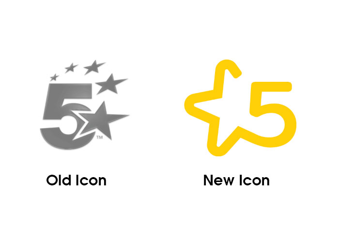
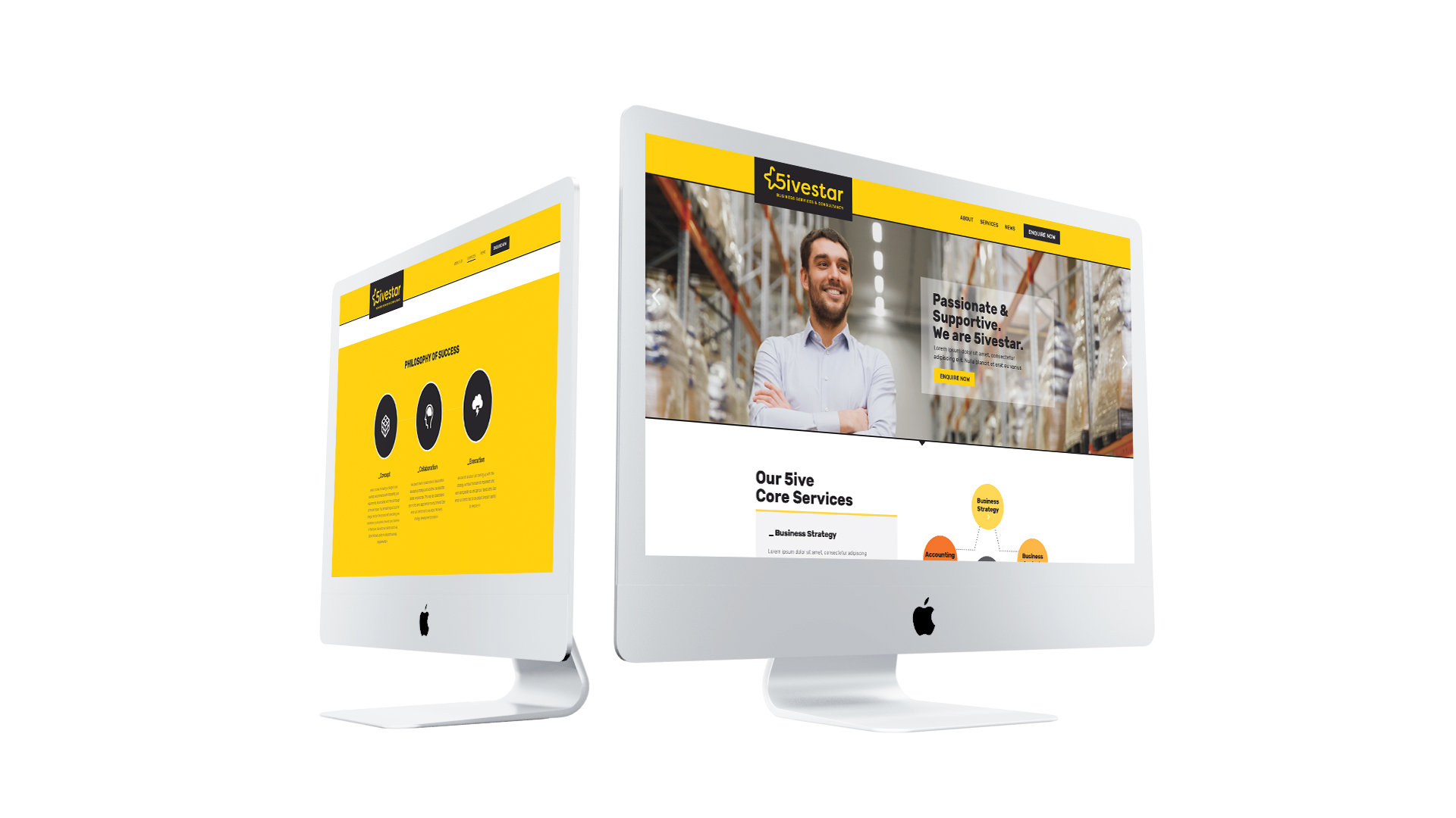
The Challenge

Not A Rating System - But Quality Service

Structured star design elements are typically associated with hotel or appliance ratings. So the main challenge was designing a 5ivestar logo which was clearly unrelated to these industries; but accurately represented 5ivestar's dedication to quality service. The Klyp team conducted discovery sessions to become well acquainted with the values and ethos of 5ivestar's owner, Michael. He had a strong focus on customer needs and took a personal interest in seeing his clients succeed. This research enabled us to develop insights which informed our decisions about branding collateral.

Colour Palette

Bright & Bold

When devising a colour scheme for 5ivestar our designers were determined to make the logo stand out from competitors, using a bold palette. A bright yellow was used as it represents power, friendliness and knowledge. Being paired with black is a great contrast and reinforces the professional nature of the Michael’s business. The combination of these intense colours reflects the exciting and proud partnership between 5ivestar with its clients' businesses. It also reinforces the consultancy firm’s down-to-earth attitude.

5ivestar Mobile Site

Concept

5 Star Service

The star logo element was a key branding concept, because the five points of the star are indicative of the five core services provided by 5ivestar – business strategy, analysis, IT strategy, debt structures, plus bookkeeping, accounting and tax. It is memorable and conveys the client’s five star, superior service offering. The logo helps to position 5ivestar as a trusted service and leader in the consultancy space. While stars are often used in formal graphic contexts, we have presented it in a contemporary fashion, as an outline with rounded corners and an open-ended form which transitions into the number five.

5ivestar Core Services
5ivestar branding collateral
5ivestar Desktop site