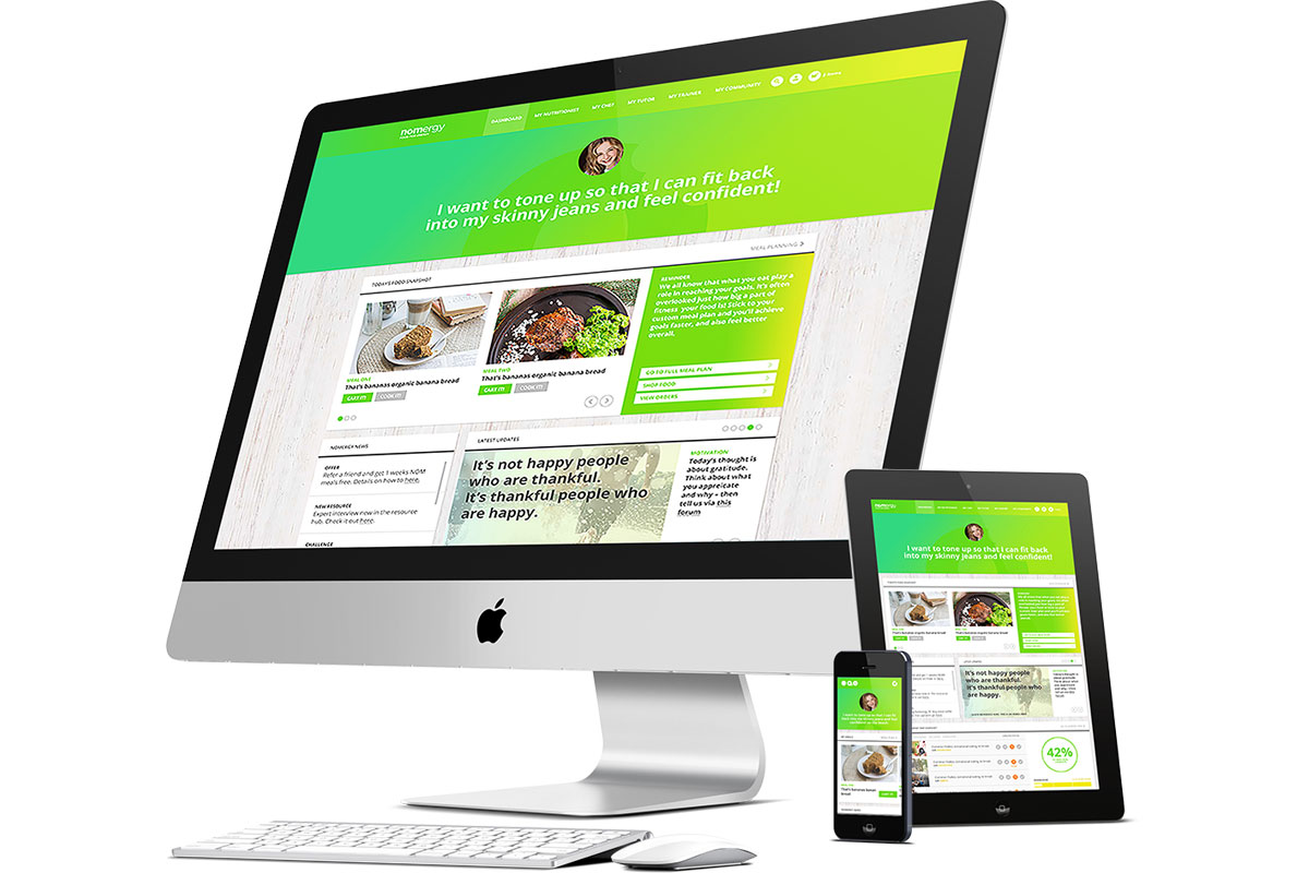
Multiple Devices
Visitors are increasingly irritated with unresponsive websites that are not suitable for significantly smaller screens, particularly when surveyed in portrait orientation. Extra actions are required to examine the content, such as zooming in to read tiny text. Not to mention the frustrating inaccuracy of selecting menus and buttons via touch, instead of a mouse click. To combat this issue, web designers began creating separate mobile sites with features like hamburger navigation, often denoted by the .m prefix. The problem with this workaround, was that it increased costs for business owners as two sites needed to be updated regularly, instead of just one. It also resulted in duplicate content, which is penalised by search engines. Nor does it account for the multitude of other devices and screen sizes which are constantly being released including; tablets, laptops which convert into tablets as laplets, smart watches, smart TVs with enormous screens and even VR headsets!


