Design

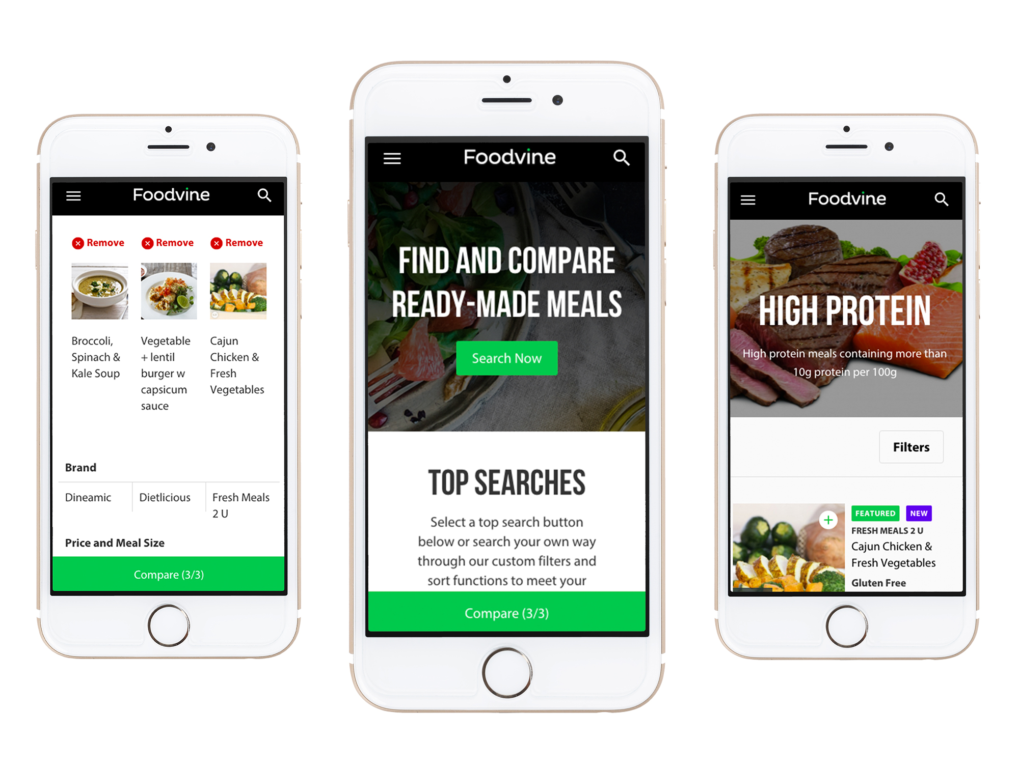
Ready-Made Meals On the Go

Foodvine was designed and developed from a ‘mobile first’ perspective. This means that our thinking and design was based around mobile usage, then expanded out for tablet, laptop and desktop screens.

The challenge for Klyp was to provide a rich source of information in an easy to digest (pardon the pun!) format.  Functionality and ease of use were pivotal in the development of Foodvine’s website, ensuring that healthy eating was as easy and achievable!

Foodvine mobile mockups

Algorithm

Developed With the User in Mind

Using a set of rules and algorithms, Klyp was able to implement a calculated  "Foodvine Rating", which rates meals based on the nutritional value. Ratings ranging from “Okay” to “Great” create a simple and easy decision-making process for the user.

The website also allows users to eliminate tough meal choices by narrowing the search to categories including “Weight Loss”, “Top Rated” and “High Protein”. Alternatively, users can sort by location, key ingredients and a variety of dietary and allergy requirements. These filters put users in control and provide valuable information about health and wellbeing.

Couple looking at phone