Queen Fine Foods
Making User Experience
A Piece Of Cake!

What We Did
- UX Analysis and Audit
- UX/UI Design
- Web Development
Overview
Queen Fine Foods is an Australian household name, known for producing quality ingredients for baked goods. Acknowledging that consumers prefer to find their products in supermarkets, Queen approached Klyp to help them increase engagement on their website, rather than optimise it for E-Commerce functionality. We undertook an extensive UX audit and implemented our recommendations to delight and excite Queen’s website visitors with engaging recipe pages. Piece of cake!
The Problem
Queen approached Klyp with a vision to vastly improve UX on their website. Instead of developing E-Commerce features, Queen strived to showcase their products in recipes, encouraging users to continue purchasing their products from supermarkets. Queen enlisted the experts at Klyp to increase session duration and average time on page and drive subscriptions to the Queen Baking Club by delighting users with effective and engaging UX/UI.
The Solution
Klyp partnered with Queen to establish a clear and refined user journey which mirrors and reflects the value of their brand. We identified existing UX problems and acknowledged what work’s for Queen’s current users to create a new and improved customer journey.
The Process
UX Audit
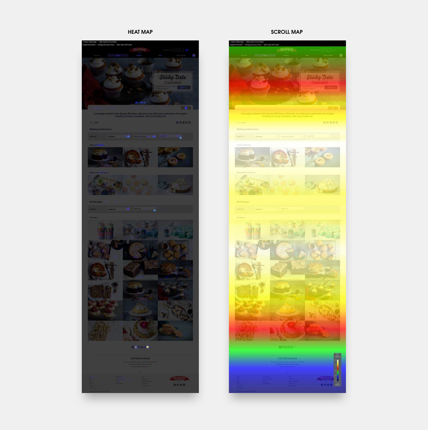
To begin the UX improvement process, Klyp began our analysis to find which features of Queen’s current customer journey were effective, and which areas could be improved. Our approach to this audit was three-pronged. We don’t like to miss anything, so we completed quantitative data analysis of Google Analytics data, qualitative analysis though consumer surveying and behavioural analysis using heat and click mapping. This analysis identified the pain-points of Queen’s users, and lead Klyp to develop UX designs to overcome these and create a greater focus on engaging content.
UX/UI Design
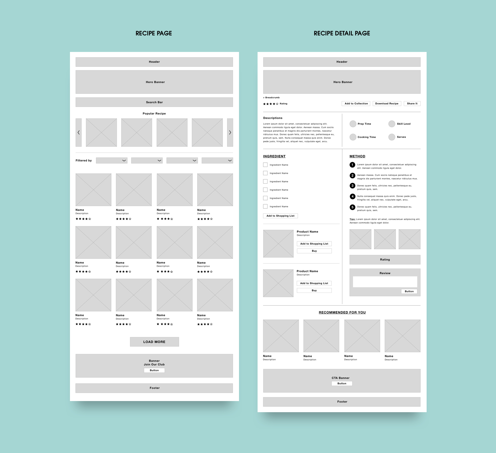
We took what we learnt in our analysis, and mocked-up our plans in wireframes. We decided to create a completely different system of searching and filtering results from the home page, and on the recipes page. This new structure considers who is searching based on Queen’s user profiles, and creates a much clearer customer journey, improving time-on-page.
Queen was focussed on improving their recipe library, and encouraging users to engage by “Joining the Bake Club”. Our audit found that users found the existing page difficult to navigate. Klyp aimed to vastly improve the user experience on this page with an enhanced filtering option, which allows users to tailor Queen’s website to derive what is of greatest value to them, as simply as possible. Easy as pie! This was implemented knowing that the more likely a user is to find what they are looking for, the longer they will spend on the site and the more they will engage with the content.
We also made some smaller changes to the overall site, which saw the navigation bar and other high volume elements mobile optimised, and the bottom menu reconstructed to improve usability.


